One setup page, not two
Checking one flat and comparing ten ask for the same information, so they share one form. Someone who already has too many options does not need two ways in.
I have house-hunted in Bangalore, and the process was a spreadsheet I built by hand: listings from Facebook, NoBroker and rental apps, a pin for each on a Google My Map, a sheet of features and a pros-and-cons tally. Rent, features and commute are the three things that decide a flat, and the commute was the one I had to work out myself. I am planning to relocate soon, which means changing houses and facing the same problem again.
Count the commute in hours a month, then put a price on those hours. Twenty minutes further away reads as nothing on a listing. Added up it is days, and priced at what your time earns it can cancel a rent saving that looked obvious. The arithmetic is plain, with no model near it, so the numbers decide and the emotion stays out of it.
Rent, features and commute decide a flat. Only two of the three are on the listing.
In 2022 I searched for a flat in Bangalore. I read listings on Facebook, NoBroker and rental apps, dropped a pin for each one on a Google My Map I made myself, went to see them one by one, kept the features in an Excel sheet or a diary, and did the pros and cons by hand before choosing.
Rent and features are written on the listing. The commute is not. You work it out yourself, one flat and one destination at a time, and the answers end up scattered across tabs and notes. For a couple it is worse, because a flat that suits one person’s commute can punish the other’s.
I wanted to take the emotion out of the choice and put the facts side by side. The problem is not special to Bangalore either. Every fast-growing city has renters doing this same search.
Some portals now let you search by commute, and maps time a journey. Between them they cover finding the home and timing a trip. None of them puts every home against every place that matters, for two people, and turns it into hours a month and a price.
Property Finder. A UAE property portal. Its app has a Calculate Travel Times feature that shows how long it takes to reach work, school, the metro or any other point of interest, and its store listing names commute among its smart filters.
Bayut. A UAE property portal. Search 2.0 lets you set two points of interest with a preferred commute time from each, and finds properties near or between them.
NoBroker. An Indian rental portal. It filters by budget and requirement and shows a locality life score. A metro-based search, reported in 2023, lets you look along a metro line, which gets you a shorter commute without timing one.
Housing.com. An Indian property portal. It searches by nearby landmarks and by flats near your location, and filters by price and amenities.
99acres. An Indian property portal. It has a map search for nearby civic amenities and suggests similar localities.
MagicBricks. An Indian property portal. It filters by type, budget, bedrooms, furnishing and locality, shows results on a map, and offers locality reviews and comparisons.
Google Maps. The baseline for travel times. You save a home and a work address, choose driving or transit, and set a depart-at or arrive-by time. It answers one journey at a time and does not list homes.
My Maps and a spreadsheet. How I searched in Bangalore in 2022: a pin for every flat, directions saved on their own layers, a sheet of rent and features, and my own arithmetic. Everything is possible and none of it is done for you.
Living In. Does not list homes, on purpose. It takes the homes you already have, times every place that matters to you for two people, adds the trips up into hours a month and prices that time against the rent.
An hour each way feels like part of the day. Added up, it is a different size.
Take one hour each way to the office, five days a week. That is two hours a day. Over a month it is 43.3 hours, nearly two full days. Over a year it is about 22 days on the road, going to work and coming back.
That is the figure Living In puts first: hours of commuting a month, with the days a year underneath. Every home is compared against every place that matters to you. Trips you cannot move, like work and school, are counted at rush hour. Trips you can move, like the gym or the airport, are counted leaving early.
The formula is one line: one-way minutes, times two trips, times visits a week, times 52 over 12, divided by 60.
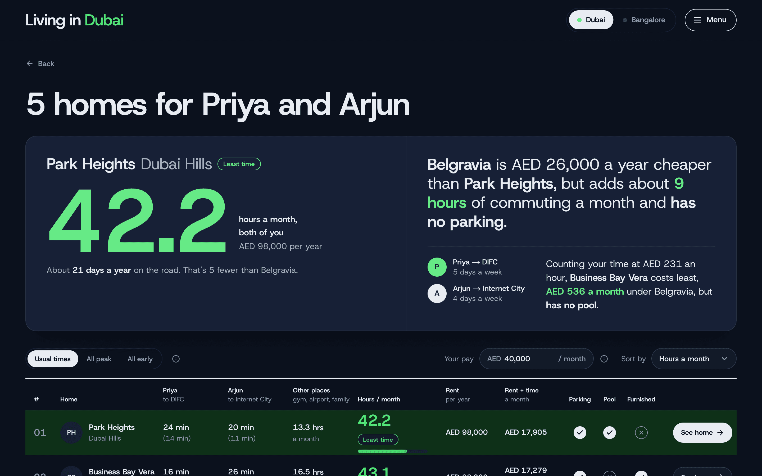
One of the Dubai examples, with monthly pay set to AED 40,000.
Belgravia is the cheapest of the five flats on rent, at AED 72,000 a year. Business Bay Vera costs AED 16,000 a year more. Once your time is counted, Business Bay Vera is the one that costs least, by AED 536 a month, because it sits 8.1 hours a month closer to this couple’s places.
The trade-off that makes people stop is on the first card. Belgravia is AED 26,000 a year cheaper than Park Heights, and it adds 9 hours of commuting a month. Priced at AED 231 an hour, those hours cost about AED 2,077 a month, so an AED 2,167 a month rent saving becomes AED 90 a month once the time is counted.
The tool then puts the question that is left. Business Bay Vera costs least, but it has no pool, so the choice is whether a pool is worth AED 536 a month to you.
One assumption sits under all of this. Time is priced at your monthly pay divided by 173.3, the hours in a 40-hour working month, so AED 40,000 a month is AED 231 an hour. It is a deliberately simple stand-in for what an hour is worth to you, and a couple shares one pay figure, either one salary or an average.
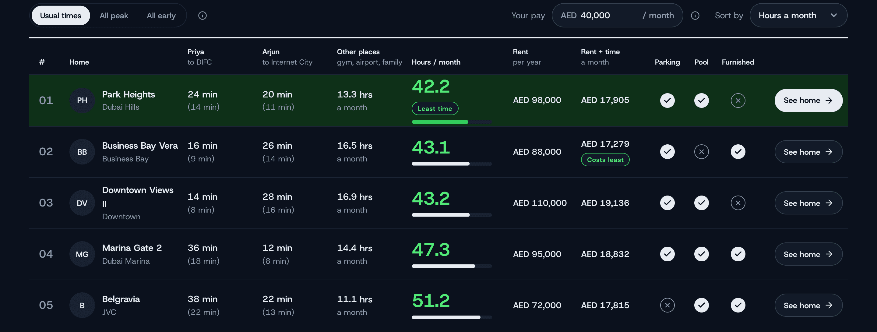
The minutes, rents and amenities in this example are hand-made. Route-time providers do not allow their results to be stored and shown to every visitor, so the examples are written by hand, and a visitor’s own comparison is always live. Using other people’s saved homes as examples was never an option I wanted: they are private.
Every number the tool shows is arithmetic over driving times, and every sentence is a rule. There is no model in the path between a commute and a figure.
One setup page, whether you have one flat or ten. Each person gets a card with a main place and how often they go. The gym, the airport, family and school sit under it as shared places.
The formula, the best time to leave, and rent plus time, in about a minute.
Checking one flat and comparing ten ask for the same information, so they share one form. Someone who already has too many options does not need two ways in.
Each person in a couple gets their own card with a main place and visits a week, so the results show one column per person. Two commutes to two offices is maths most people cannot do in their head.
Every number is arithmetic and every sentence is a rule, because the point is to let numbers decide. If a later feature needs a model, such as reading listings, that is when one goes in.
The first version asked for an hourly rate. Most people do not know theirs, so it now asks for monthly pay and works the hour out itself.
Tick and cross are told apart by shape, never green and red, and routes use line weight and dash, never traffic-light colours. Nothing relies on colour alone.
The first version counts driving only. Metro and bus times barely change with the hour, which would have weakened the rush-hour story. The routing provider I use does not do them anyway, so they wait.
It is an MVP I built as a hobby, and I kept it on free tiers because I did not want to spend money on it until it has all the premium features and can become a proper business tool.
My first plan used Google for addresses and driving times. Two ideas were about to go in: storing the example comparisons’ live drive times so every visitor saw real numbers, and drawing Google’s routes on an OpenStreetMap map.
I read the terms before building either, and both were out. Google does not allow its results on a map that is not Google’s, or its route times to be stored. TomTom, the provider I moved to, does not allow results to be stored to serve several users either, so I could not fetch the times once and keep them for the examples. That is why the homepage examples are hand-made. Catching it before the code existed saved a session of migration.
What runs now is TomTom for addresses and driving times, over OpenStreetMap tiles. TomTom’s free allowance is 20,000 route requests a month with no card on file, so it stops at the limit and does not bill. Living In stops its own lookups at 18,000, a little before that, and shows “Demo limit reached” instead of a provider error.
Dubai and Bangalore. A new city is configuration and data, never a component change.
Every number is arithmetic and every sentence is a rule.
TomTom’s free allowance, with no card on file. Living In stops its own lookups at 18,000.
I started by studying how the property platforms work, Property Finder for Dubai and NoBroker for Bangalore, and took layout ideas from them. I turned a rough idea into mockup images with ChatGPT, reworked the screens by hand in Claude Design, and built the product with Claude Code.
My part was the product calls, the rejections and the QA rounds: reading the terms, deciding what to cut, and checking every screen myself. I threw out my own first look, a cream ground with heavy headlines, because it read as generated, and moved to a night-navy ground with one accent colour per city. I also used skills I downloaded and ones I wrote for Claude Code, for the SEO and launch checks and for checking the tool itself.
How I build with these tools.
The method I use across my projects, and what I will and will not hand to a model, is written up on its own page.
Read how I buildA colleague saw it in a demo I gave her. She called couple mode the game changer. Working out one person’s commute to one destination is maths you can still do yourself. Add a second person with a different destination and it becomes a whole new layer of maths, which the tool does for you. On top of that, you can add the secondary places you visit regularly, so the comparison gets granular, and you see it laid out instead of doing it in your head, which makes the choice easier.
The other lesson was about me. I should not have to be in the room. If a demo is what makes the product make sense, the product is not clear enough, so I built a short walkthrough: seven steps that point at the real controls, offered to first-time visitors.
The tool is public and works without signing in. You can open a ready-made example, share a read-only link to your own comparison, or sign in with Google to keep it.
Already built from the second phase: the best time to leave, and rent plus time. Next, in order: a departure-time slider and typical ranges for each commute. Metro, bus and two-wheeler times are blocked for now, because the routing provider I use only does cars, so they wait for a second provider whose terms I have read. Pulling in live listings is something I am exploring, terms permitting, starting with a way to send one address at a time from a listing page. After that, more cities, picked where I know people who rent and will tell me straight whether it works. Mumbai, Delhi and Abu Dhabi are next.
A rental comparison and a content platform ask for the same habits.
Numbers are arithmetic, words are rules
Nothing here needs a model, so none is used. If a later feature does, it goes in on purpose.
Read the licence before building on the data
Provider terms decided the architecture: where results can be stored, which map can be shown, and why the examples are hand-made. Reading them first cost reading time. Finding out later would have cost a migration.
Say what is an assumption
Time is priced at your pay, a couple shares one figure, and the examples are hand-made. Each is said plainly on this page and not left for someone to discover.
I build systems that turn growth opportunities into scalable outcomes. Have a challenge worth solving? Let’s connect.